

- are minimalist with sans serif fonts and a simple design
- strongly reflect the front cover
- display institutional information such as the record label's logo or a barcode


Dan Croll - Sweet Disarray

The XX - Self Titled
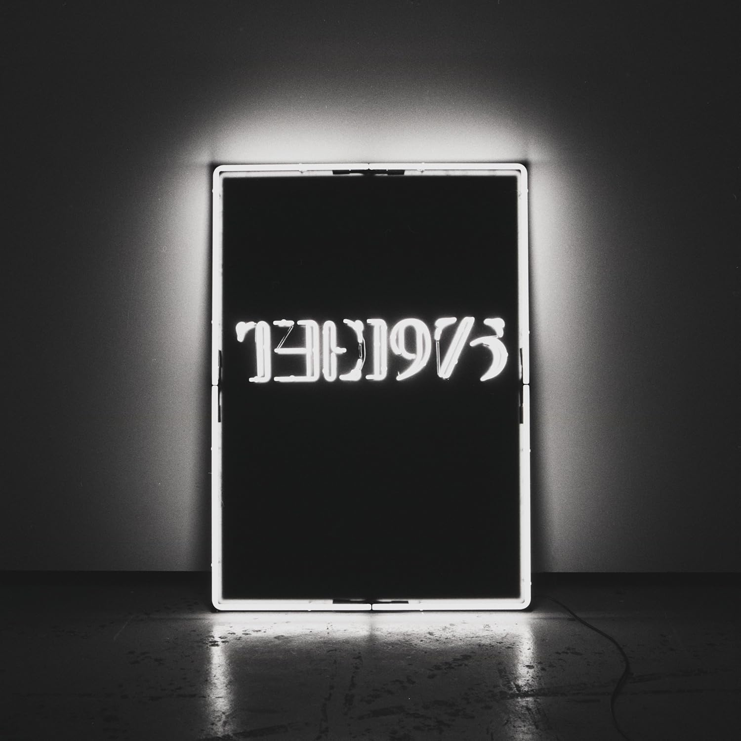

The 1975 - Self Titled

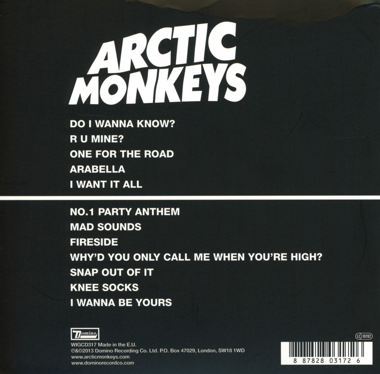
Arctic Monkeys - AM
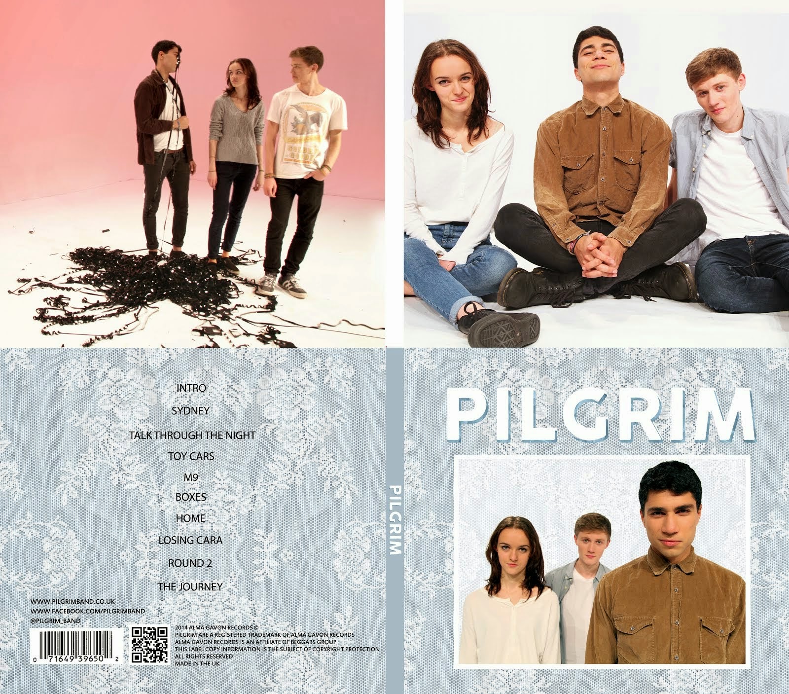
Taking inspiration from these albums, we decided to keep the texture from our front cover and have a simple track list with institutional information at the bottom. Alice made the following design so that we could see what it looked like. We hadn't decided any names at this point so the design is nothing more than a template.

For the inside panels, we looked again at other albums for inspiration.
 |
| The 1975 |
 |
| Arctic Monkeys |
We looked through all of the photos of the band from our shoots and selected the following image. We liked it because it shows the band's playful side, compared to the more serious front cover. The pink also goes nicely with the blue front cover.

Alice and Mahalia then worked on cleaning up the photo, removing the dark line, making the lighting on the wall more even and brightening the band. The end result was the image below.

Once we were all pleased with the picture, Alice dropped it into the digipak template and posted it to our Facebook group so that we could all give our feedback. We also talked about it in person the next day.

Overall we thought it worked really well but Mahalia suggested that we should make the picture smaller as it was a bit more subtle, leaving more empty space for the CD. The two images below show the picture in the digipak, before and after Alice resized it.
 |
| The orignal image |
 |
| After resizing the pink image |
No comments:
Post a Comment