
Band Identity
Arctic Monkeys - AM
I analysed how Arctic Monkeys promoted their latest album, AM, and how they created synergy in their marketing campaign.
I analysed how Arctic Monkeys promoted their latest album, AM, and how they created synergy in their marketing campaign.
Our Band Image
We created a unique image for our band by using our three artefacts to create synergy.
Words that describe our band and the themes of their music
Website:
Our website also reinforces our band's identity. For example, this Behind-the-Scenes video from the music video shoots shows the band playing around with each other and having fun. This presents them as genuinely funny and relatable people.


Our Marketing Campaign
This prezi identifies the personalities of our band members and of the band as a whole. I have also shown how these personalities are reflected in the music video.
Website:
We also have a bio page for each band member to add depth to their personalities and make them more authentic.
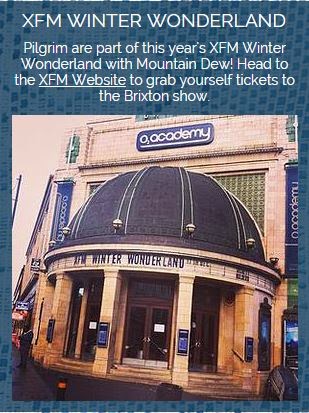
There is also symbiosis between our band and indie companies like XFM and NME on our website. We decided to have posts that involved these institutions so that our indie image would be strengthened through the association with them. This also increases the reach of our marketing campaign since we are able to target fans of the institutions that we work symbiotically with.


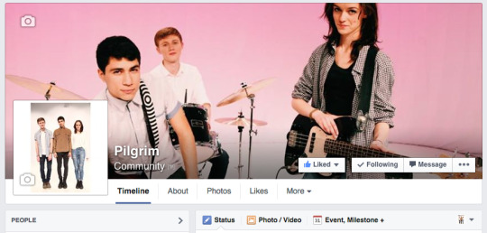
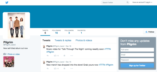
We also increased the reach of our marketing campaign by using multiple social media platforms. We took advantage of the strengths of each platform, making our Instagram page very visual and using Twitter more for short text updates. However, we did try and use all three to promote certain things such as the album. This meant we were able to appeal to different audiences depending on which platform they prefer, while still widening the reach of our album promotions through using multiple platforms.
Finally, by juxtapositioning the very vintage lace texture with the modern posts and web tools combines the band's modern style with their nostalgic themes
We also increased the reach of our marketing campaign by using multiple social media platforms. We took advantage of the strengths of each platform, making our Instagram page very visual and using Twitter more for short text updates. However, we did try and use all three to promote certain things such as the album. This meant we were able to appeal to different audiences depending on which platform they prefer, while still widening the reach of our album promotions through using multiple platforms.
 |
 |
 |
Finally, by juxtapositioning the very vintage lace texture with the modern posts and web tools combines the band's modern style with their nostalgic themes
Our Marketing Campaign
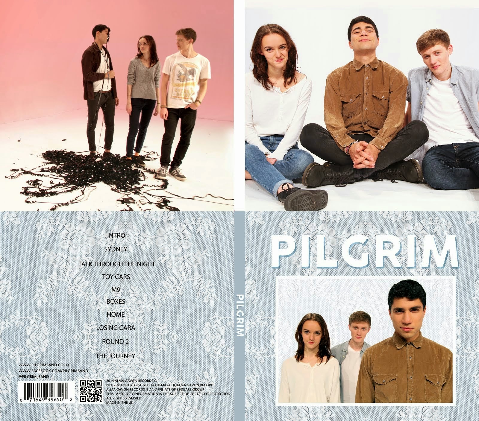
Our three artefacts work together synergistically. We achieved this through using a consistent colour scheme and texture throughout the project as well as incorporating the band's logo into our three artefacts.
Logo and Font
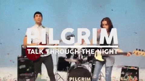
We used the same logo in our three artefacts. The logo is present on our album cover and on the sleeve, as well as on our website's banner, meaning it is at the top of every page. We also included it on all of our merchandise in the website's store. In our music video, the logo was placed on the bass drum so that it is present throughout the video. We also finished the video with the logo on the screen to cement the branding in the viewer's mind.


Texture
...
Our Colour scheme was blue, grey, and white. We tried to stick to this as much as possible when creating our three artefacts to make them all work together and feel connected. As the project progressed, we started to incorporate pink into the colour scheme as we felt it worked well with the other shots and reflected the more feminine side of our band, appealing to female members of our target audiences.
The performance shots of in our video alternate between blue and pink backgrounds. Our costumes for the performance shots are predominantly grey, white and blue to match our colour scheme. Alice is also wearing a black top which makes her stand out slightly.


Our final shot is the blue performance setup with the band's logo on the screen. This again reflects our colour scheme with the blue background, the white and grey costumes and the white text.

Our digipak also follows the colour scheme, with the outside covers consisting of blues and whites and the inside panels being predominantly pink and white.
 |
| Outside covers - predominantly blue, grey and white |
 |
| Inside panels - predominantly pink and white |
Finally, our website follows this same colour scheme. The blue of the background is the dominant colour and throughout the website we have used pinks, whites, greys and blues.
 |
| Our homepage - the boxes are all blue, grey and white and we have included pink images such as the tour banner and the music video thumbnail. |
  |
| Our tour page is a good example of how we incorporated this colour scheme into our website. The colour palette that we used for our tour page is shown above. |
Pilgrim's Website
I have explained below how we made our website interactive, as well as the learning and purchasing opportunities that we have incorporated.
No comments:
Post a Comment