
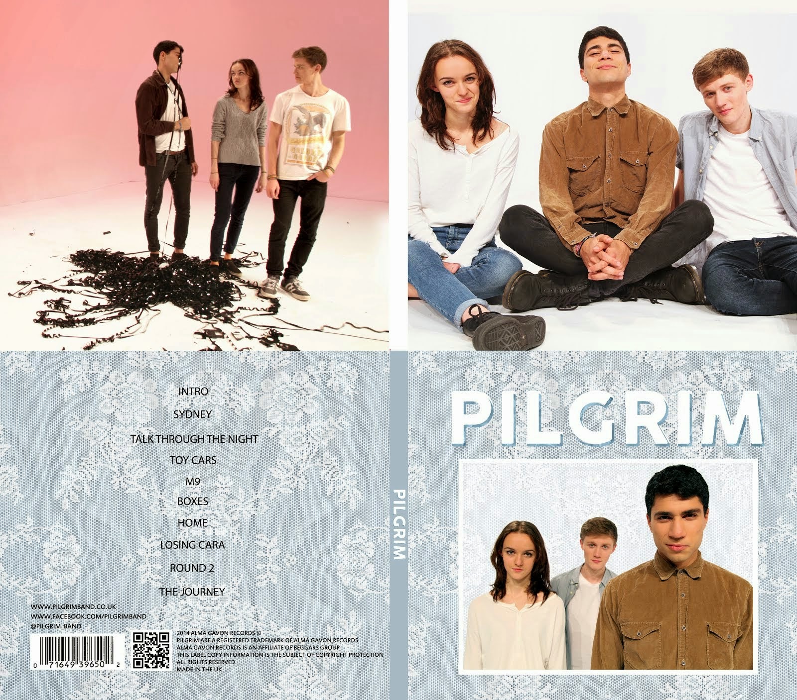


These are 9 photos that we picked out of all the publicity shots we had taken throughout the project. We felt that these pictures would work best on the album cover. They are all quite unique and they all have interesting compositions and poses. Some are more serious than others as we wanted some variety to choose from.


After this, we thought about which texture we preferred as well as how the designs could be improved. We approached three members of our target demographic for qualitative research purposes and found that they preferred the blue design. They also said that they didn't like the picture as it is too casual and doesn't really look like a band. We took this on board when making the following design.

This is a similar design to the previous one but we have used a different picture. We feel this picture looks a lot more professional and is more serious than the other one. A well as this, it has quite a lot of depth which keeps it interesting and it is very obvious who the frontman is and who is less important (me) by where we are positioned. We will still use the previous picture on our website or possibly in our digipack but we think that this suits the front cover well because it is quite serious while still staying interesting through its composition. We also decided to move things around, placing the word above the picture instead of below or over it. This means there isn't too much empty space and the picture isn't obstructed. We felt having the word below the picture looked too much like a polaroid picture or a calender. Finally, we added a drop shadow to the word to make it stand out from the texture more. After adding some colour correction, we arrived at the above image.
Again, we asked for some feedback from members of our target audience as well as thinking about improvements ourselves (since we are also members of the target audience and know what forms and conventions should be followed after researching album covers in the indie genre). The feedback we got was mostly positive. They liked the composition of the whole cover and said the picture was a big improvement on the previous one. However, they found the drop shadow slightly unappealing saying it looked a bit unprofessional and made the title look like WordArt:
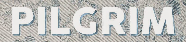
We agreed that the drop shadow did ruin the professional look of the cover. However, we needed something to make the text stand out from the background. I suggested that we experiment with some textures and made the following designs for the title by isolating the shadow from the word and then using clipping masks to overlay textures over the word and the shadow separately.
 |
| Clipping masks |


In the end, we decided to keep the word plain so that it would still stand out clearly from the background texture and used a papery texture to add detail to the shadow.
 |
| Our final title design |
No comments:
Post a Comment