There are conventions that are followed by albums of all genres in the design of the back cover. Below are six album covers. All of the albums are indie or some variation of the indie genre, (eg. indie pop, indie rock). The top three designs use images that are similar to the images on the corresponding front covers. The bottom three images are plain with just the tracklist down the middle and institutional information.
 |
| The Libertines - Up The Bracket |
 |
| Palma Violets - 180 |
 |
| Darwin Deez - Songs For Imaginative People |
 |
| Ed Sheeran - + |
 |
| Damon Albarn - Everyday Robots |
 |
| Royal Blood - Self Titled |
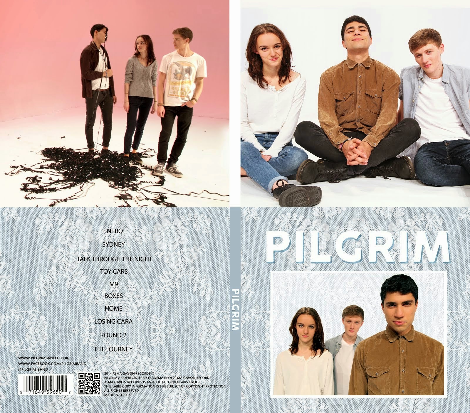
We preferred the plain designs to those that used photographs and felt that this style would suit our album best. Building upon the previous design for the back cover that Alice made, we thought of some track names and added some more institutional information. Our back cover now consisted of a track listing in the centre with a textured background, (the same texture from the front cover), as well as a barcode, a QR code, URLs for the band's website and Facebook page, a Twitter name, a copyright logo, the record company name, (Alma Gavon Records), the parent company, (Beggars Group) and a couple of other bits of institutional information.
We also changed the spine to be a plain blue instead of continuing the texture over the spine as it made the text much easier to read.
We also got some feedback on our inside cover from our teacher and some classmates. Most people agreed that they liked the picure that we used but felt that the left panel was too empty. Many people suggested filling the left panel with another picture of the band. We decided to move the picture on the right panel to the left and put a different picture on the right. We tried to pick a picture that was a bit different to the ones we used in the left panel and the front cover to show a different side of the band's personality.
 |
| Our previous design |
 |
| Our final design |


No comments:
Post a Comment