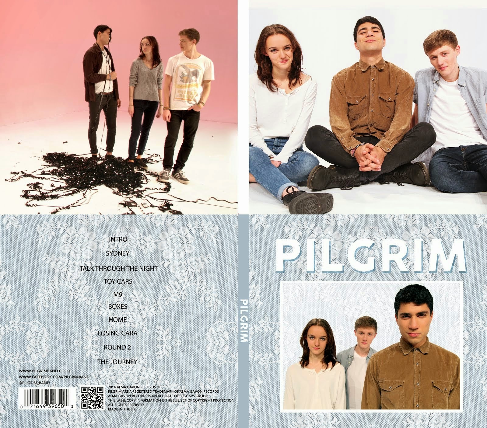
There are different styles of album covers. Some are very simple and will only have a logo with a plain background or even just the name of the album in the centre. Others are based around a focal image and can be quite simple or more abstract. Some artists have recurring themes in all of their album covers such as vibrant colours or a band logo. The best album covers are unique and recognizable. I also much prefer when album covers are simple and not cluttered.
Bands with recurring themes
Bands use their album covers to create an image for themselves. It is fairly common for bands to have recurring themes in their album covers to create a sense of identity for the fans. It creates the sense that these are all albums by the same artist and not just collections of singles.
 |
| Band of Skulls - Symmetrical graphic with a simple colour scheme |
 |
| Belle and Sebastian - Monochromatic pinctures of people with simple bold text |
 |
| Muse - Bright colours and a recurring logo |
 |
| Queens of the Stone Age - Very simple with only one colour, a graphic and some text |
 |
| Radiohead - Bright, abstract images. Each is distinct but similar in a way (all are done by Stanley Donwood) |
 |
| The XX - Very simple graphic of a cross filled with an image |
 |
| Vampire Weekend - Thick white borders, simple colour schemes and bold white text in the same font |
 |
| The White Stripes - Very distint colour schemes of red, white and black |
Plain with just text
Some artists go for a very minimalist look for their album covers. It draws on the idea that less is more as album covers without any artwork will actually stand out from other album covers. Frank Ocean's 'Channel Orange' stands out in particular because it is such a vibrant orange colour.
 |
| The Beatles |
 |
| Frank Ocean |
 |
| Arctic Monkeys |
Four images in a grid
This is an idea that has been used a lot by different artists. It is very simple and creates an instant connection between the fan and the artist because we are seeing them without any graphics or other images that could distract us. Blur's 'Best Of' is also heavily influenced by the pop art movement, attracting fans of that style of artwork and standing out with its bright colours.
 |
| Everything Everything |
 |
| Gorillaz |
 |
| Blur |
 |
The Beatles
|
Simple graphic
This is possibly the most common style of album cover, especially within the indie and alternative genres. A simple graphic is something that can be instantly recognized and easily advertised. Using bright colours like in Death From Above 1979's or Primal Scream's covers is eye-catching and some albums like Dark Side if the Moon, (Pink Floyd), or Unknown Pleasures, (Joy Division), have become iconic within fans of the genres. This iconic status can't be achieved as easily without a unique graphic.
 |
| Arctic Monkeys |
 |
| Pink Floyd |
 |
| Death From Above 1979 |
 |
| Franz Ferdinand |
 |
| Daft Punk |
 |
| Primal Scream |
 |
| Swans |
 |
| The Black Keys |
 |
Joy Division
|
Photographs
These covers are very common for indie music. They are normally quite arty and create an image for the artist. For example, James Blake's album cover is very recognizable and instantly tells us that his music is different and unique. The most important thing is that they instantly create a tone for the album and strongly convey the genre.
 |
| The Vaccines |
 |
| The Strokes |
 |
| Jake Bugg |
 |
The Beatles
|
 |
| LCD Soundsystem |
 |
| SBTRKT |
 |
| James Blake |
Conclusion
There is a huge variety of album covers. It's hard to find things that every one of the album covers above have in common but there are some patterns that are followed. Each of the album covers are unique in some way. They either have an interesting colour scheme or focal image or are composed in some way that makes them individual. Some album covers purposefully imitate other album covers. For example, 'Demon Days' and 'Best of Blur' both have the same grid format. In this case, Damon Albarn is the main man behind both bands and the similar style of album cover is acknowledging this and giving fans another layer of meaning and interpretation from the artwork.
Overally I think it is important that bands create an image for themselves and one of the most important ways to do this is through their album covers. Bands like 'The XX' and 'Belle and Sebastian' have managed to create a very unique image for themselves and their albums are instantly recognizable.


No comments:
Post a Comment