We looked at lots of different websites and particularly liked these ones. They all have features that we may take inspiration from when designing our website. The artist/band name below each picture takes you directly to the website in case clarification is needed on anything.
 |
| Red Hot Chili Peppers - The use of colour on this website is very interesting. The whole website changes colour to match the icon that you hover over. I also like the layout. The left half of the page is mostly empty with the logo from their latest album. This is quite individual and really draws attention to the fly, promoting their latest album. |
 |
| Little Comets - This website has a simple colour scheme with quite a plain design and a very consistent overall theme. It is a good example of how a website can be very simple yet still unique and interesting. |
 |
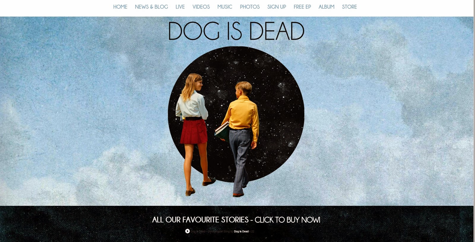
| Dog Is Dead - There is a very unique feel to this website with the clouds. The slim font goes well with the thin lines that separate everything and the website is very obviously for an indie band and promotes the album well. |
 |
| David Bowie - This website is quite individual and is extremely visual with very little text. We may choose to have a layout like this for our website as it is very good at reinforcing the image of an artist/band. |
 |
| Radiohead - This band is quite unique and has a very devoted fan base, meaning their website doesn't have to be very complex as they aren't really trying to gain fans or attention. The simple blog format is quite interesting and creates a connection between the members of the band and the fans with simple posts that are signed by the band members at the end. We may choose to emulate the simple style but perhaps this minimalist attitude isn't the best idea for us as we need to create a strong image for our band and advertise the album. |
 |
| Dan Croll - This is another example of how a simple website can be very effective at promoting an album. Because the whole website is very plain with very little colour, the bits that are colourful, (promotions for the album in this case), really stand out. The website as a whole doesn't feel cluttered and is easy to use. |
 |
| Biffy Clyro - This website is very striking visually. The artwork from their latest album dominates every page and promotes the album strongly. The whole website is dominated by artwork and visuals. This may be a good idea for our website if we want to reinforce our band's image. |
 |
| The 1975 - Again, this website is very visual and is dominated by pictures of the band. The colour scheme is very obviously black and white to match the album artwork and the overall look of the band. Artist image comes through very strongly overall and overall it is quite visually appealing. |
Conclusion
There is a lot to think about and a lot of possibilities for how we could design the website. One thing we found is that the website is usually based visually on the artwork from the band/artist's latest album. This means that, in terms of visuals, we will design our album cover before we design our website and then base the website's design on the album cover. We need the website and the album cover to work synergistically to promote and reinforce our band's image. We want our website to have all the conventional features that websites have, (photos, music, news, etc.), and promote the album and artists effectively.


No comments:
Post a Comment