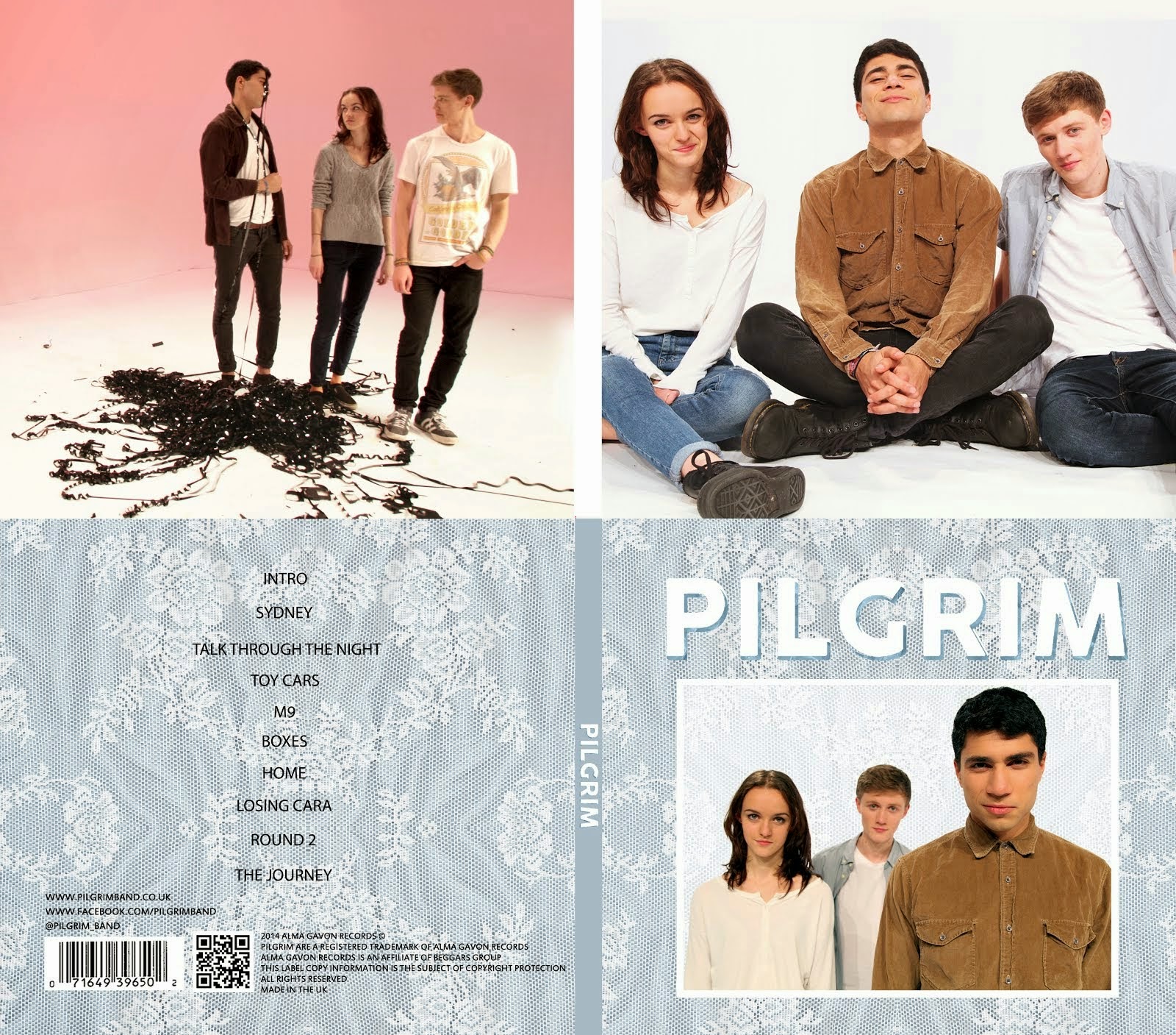
We want to have a shot of our band on our album cover as this is fairly typical of debut album covers and established our band's image well. We decided to do some research into publicity shots from similar bands and artists to ours and try and find some conventions and similarities between them all.
Bombay Bicycle Club
- Lead singer in the centre
- Simple clothing (shirts, jeans, t-shirts)
- Natural locations (street, park)
- Direct address
- Happy, laid-back facial expressions
Clean Bandit
- Fun shots (bubbles, mugs)
- Direct address
- Unnatural settings
- Fun shots with all of the band smiling
- Well lit
 |
| There is a vignette on this shots to draw attention to the centre of the frame. |
Dan Croll
- Shot in studio
- Consistent look for all four pictures
- Well lit
- Simple outfits, typical of indie genre
- Same glasses in all four shots
- Vignette
- No direct address
Daughter
- Highly stylised
- Some direct address
- Muted colours with high contrast
- Very indie outfits
Metronomy
- Unique band image
- Very stylised
- Very colourful images
- Stylised outfits
- Very little direct address
- All shot in unnatural settings
- Quite serious expressions in the top two pictures
- Vignettes
Vampire Weekend
- Natural settings
- Direct address
- Mostly serious expressions
- Muted colour scheme for their clothes
- Going for a mature image
Paramore
- Very colourful images
- Obvious vignettes
- Indie outfits
- Interesting poses
- Red is a significant part of their image
Conclusion
Some conventions we found:
- Distinct colour scheme for clothing
- Poses and composition clearly conveys band image
- Vignettes
- Direct address (or lack of it) affects tone of the shot greatly
- Highly stylised images convey artist/band image more effectively
- Studio shots tend to be more visually appealing
- A unique artist image is key


No comments:
Post a Comment