We really needed to focus on getting all the shots done as we needed to finish our animatic. The first thing on our list was to draw all the shots that we were going to have so that we could put them in our animatic, (the second thing on the list), and visualise our video more easily. We also started working on some designs for the album cover, although this was less important as we really needed to focus on the animatic. Alice did the majority of the work on album artwork although I did make a few designs as well after the animatic was finished.
 |
| Our agenda for this week |
 |
| Shot sketches (Different colours represent different shot types) |
We had a session with an ex-student during the week who specialises in make-up. She discussed what look we were going for in our video and put some make-up on me to show the others how to do it for the shoots. Kayvon and I are keeping it fairly simple, covering any spots or scratches on our faces. Because I have blonde eyebrows, I will also have some make-up on them so that they are defined enough to look good on camera. Initially we were going for a simple look with Alice too but we have since decided to make her stand out a bit more as we want an aspirational and unique female bassist and simple make-up would make her blend in a bit instead of standing out.
 |
| Testing make-up on me |
 |
| Our notes from the make-up session |
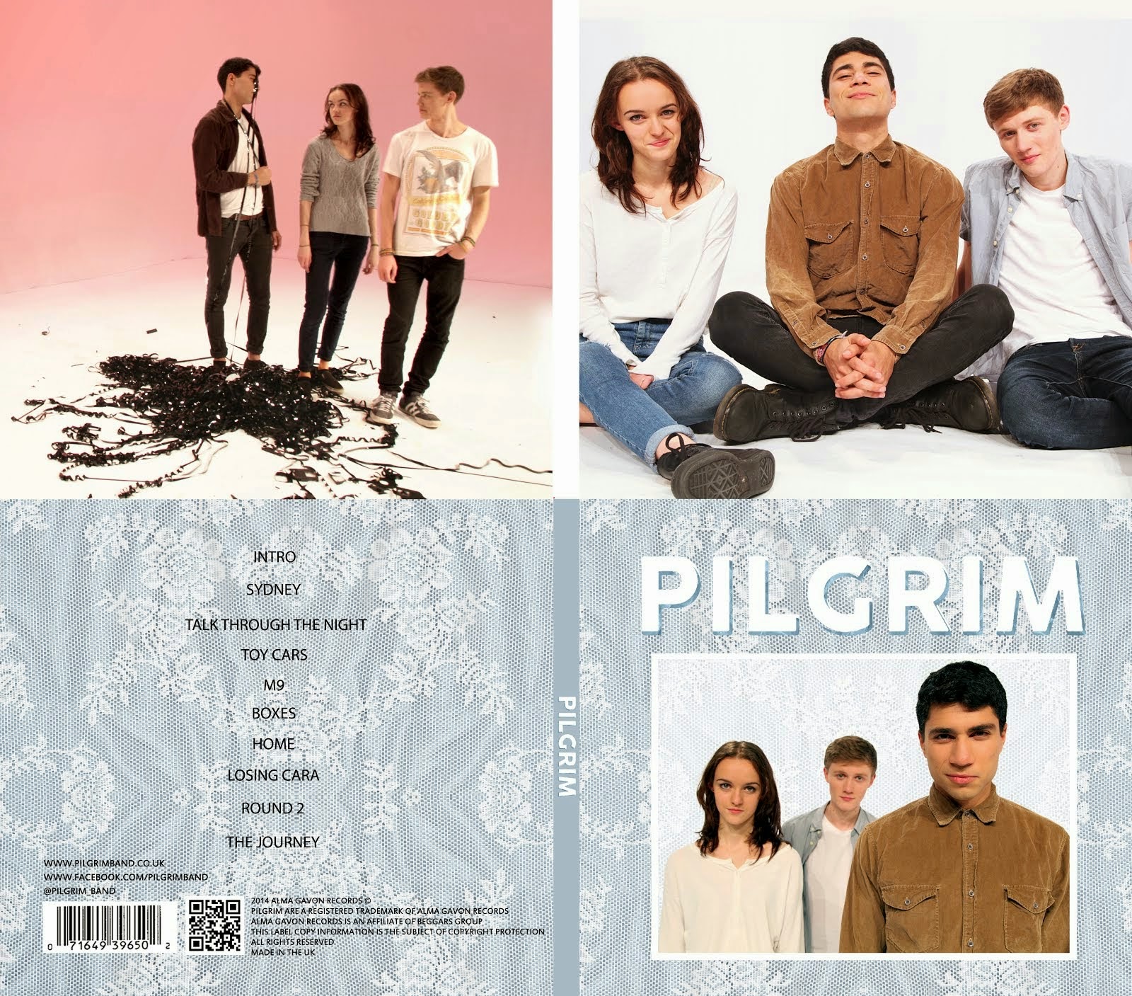
We started work on our album cover. Below is a scan of a page of notes that we took on some covers that we liked in particular as well as two very rough sketches of possible designs for our cove; the top one is mine and the bottom is Alice's. We had fairly similar ideas and are in agreement that we want a bold sans-serif font with a border and an image of the band.
 |
| Some notes on album covers that influenced us |
 |
| Early sketches of possible designs for our album cover |


No comments:
Post a Comment