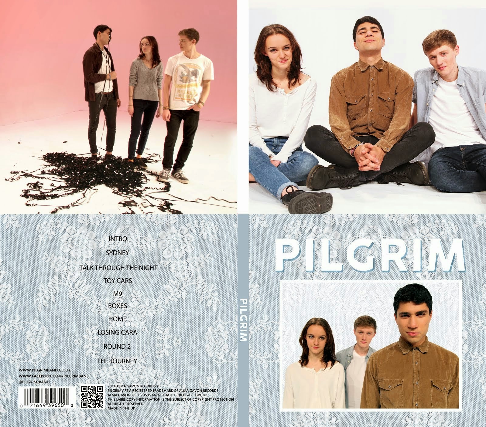
These are two sketches that I drew. They are flat plans for posters that we are going to sell on the store. Having a poster is fairly typical for indie bands. We decided to keep them fairly simple by just using images of the band with the logo. This reinforces the band's image without relying heavily on graphics. This is fairly typical for bands releasing a debut album as they need to establish their own image before their artwork can start becoming more conceptual or abstract. In the portrait poster, we are using the blue texture from the website and the album cover. This creates synergy between all the different elements of the promotional campaign and hopefully makes the poster more appealing.
We are pricing the posters at about £5. This is slightly cheaper than band posters are typically as we want our merchandise to be affordable, meaning more will be purchased.


No comments:
Post a Comment