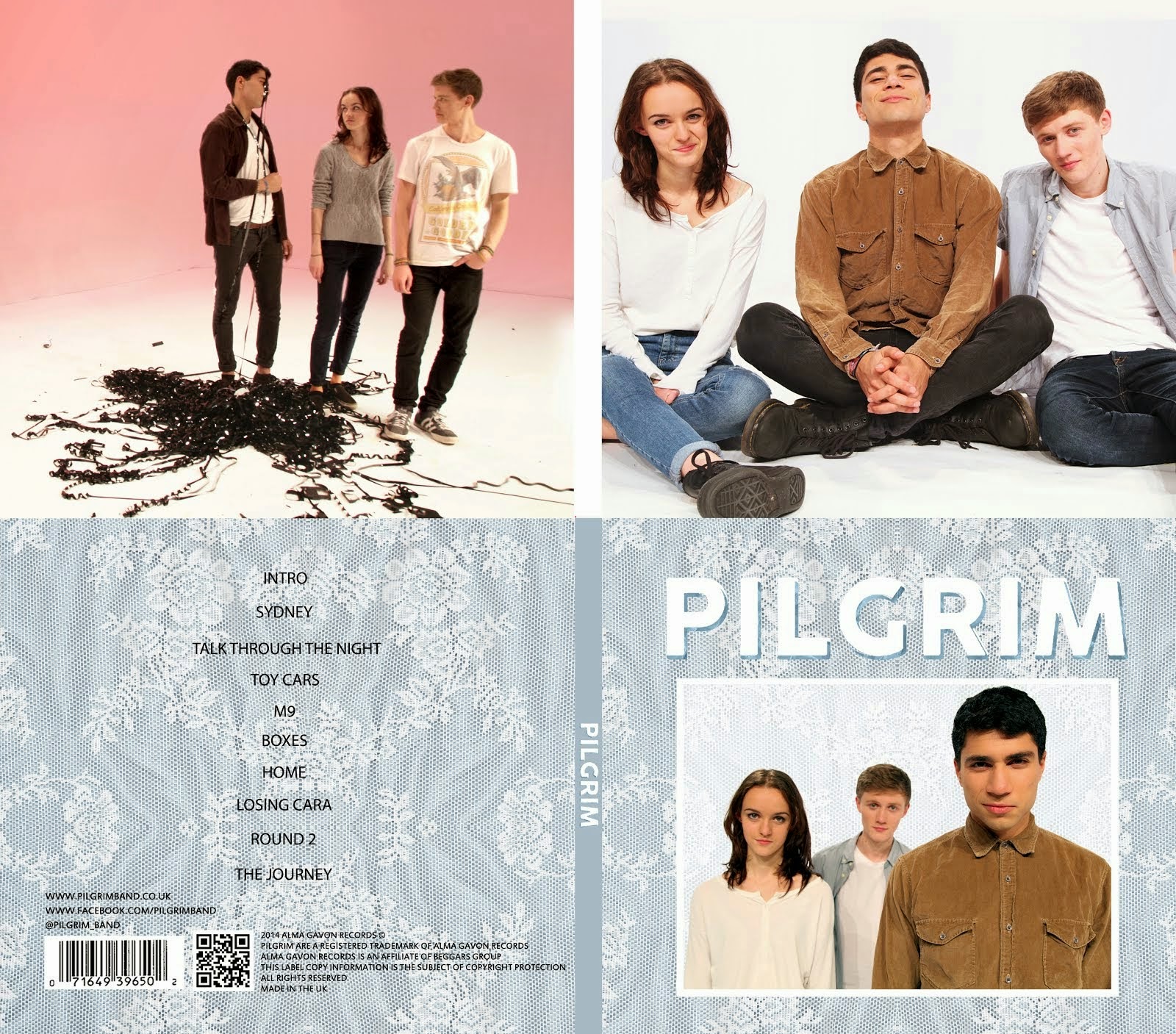
One part of our image that we hadn't really put much thought into was the texture that is used in our album cover and throughout the website. We only picked it because we were experimenting with lots of different textures for our album cover and we liked the look of this one the most. We then used it in the design of our website because we wanted synergy between the two artifacts. It is just an image that we found on the internet and we didn't really think much about its connotations or put any effort into creating it. People responded very positively to the lace texture and said it was very memorable. Therefore, we decided to rethink our branding and change the texture to something original that reflected our band's characteristics.
 |
| The original lace texture that we used |
We thought about Pilgrim and how we would describe them as a band. Pilgrim are a fun, quirky band that are laid-back and enjoy playing music. People described the texture above as homely and quite vintage, saying it reminded them of curtains or pillowcases. They also said it was quite feminine.
The homely, cosy connotations of the texture reflect Pilgrim's approachable and inviting quality and the slightly feminine feeling contrasts the idea that indie bands are stereotypically male and reflects Ash, the female bassist, nicely.
 |
| Our album cover with the blue lace texture |
 |
| An early version of our website, again using the blue lace texture |
Once we had decided what the texture said about the band, we agreed that we should make our own texture rather than use one that we found on the internet. Mahalia looked around her house and found some lace fabrics that she could scan.
These two are my favourites out of the ones that she scanned. As a group, we decided on the left one. We made it brighter in Photoshop and mirrored it horizontally and vertically so that we could scale it up for the website.
We then altered our designs for the album cover and the website so that they used this design. We made the texture a bit more saturated for the website as we wanted it to be a bit more vibrant and visually appealing.
 |
| A page from our website with the new texture |
 |
| Our new album cover with the updated texture |


No comments:
Post a Comment