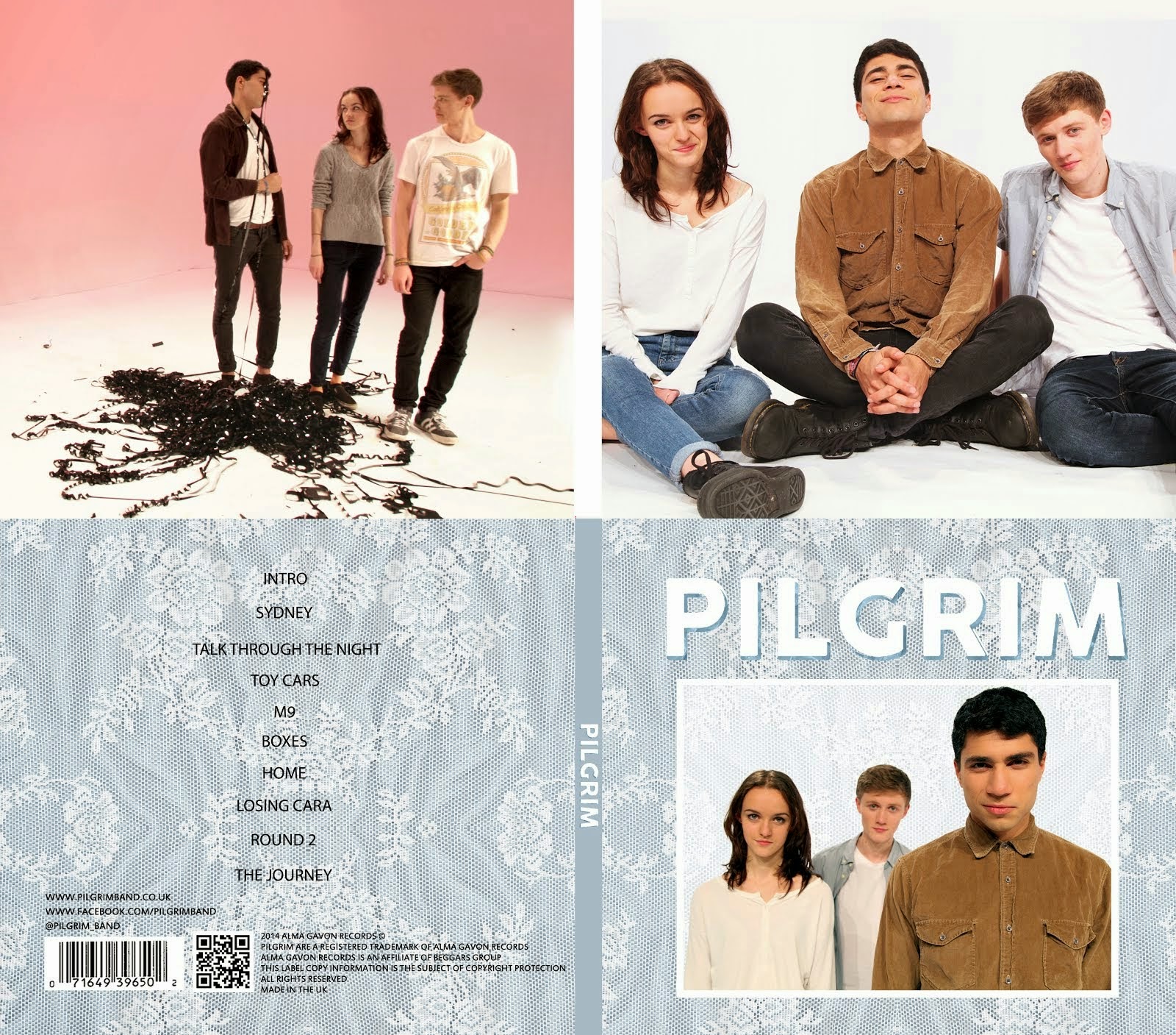
Alice created these designs using shots from our photo shoot on Wednesday 12th November. We looked through all the photos and decided that these were the best. We then used them in the photoshop file that we already had from our previous designs and replaced the pictures of other bands that we had been working with up to this point.
I personally prefer the first picture as I think the composition is more interesting as there is more depth and each of the band members appear to have a distinct personality. The second picture lacks depth and our poses aren't as interesting. I do like the outfits as we have managed to make Kayvon stand out without making me and Alice look boring.
We can still improve on these but they are close to what we want. Mahalia pointed out that she didn't like the colour scheme and Kayvon agreed. He also said that he liked the left picture more but he thought that Alice's top blended into the background a bit and he thought there was too much space above her head. As well as this, I thought that she was too far to the left. We will try to fix this in Photoshop by scaling her up a bit and moving her closer to me and Kayvon but, if this does not work, we may need to reshoot. Ideally we won't need to do this as it is very time consuming and it is much easier to fix the problem in Photoshop, providing it can be done.


No comments:
Post a Comment