We have collected lots of images, (mainly album artwork), which contain elements that we like. Below each image is a short description of what it is about the image that inspires us.
Front Cover
 |
| White text with a thin line between the two lines of text |
 |
| Nicely arranged text with a box to separate it |
 |
| Very distinct colour scheme with white text separated by a thin line |
 |
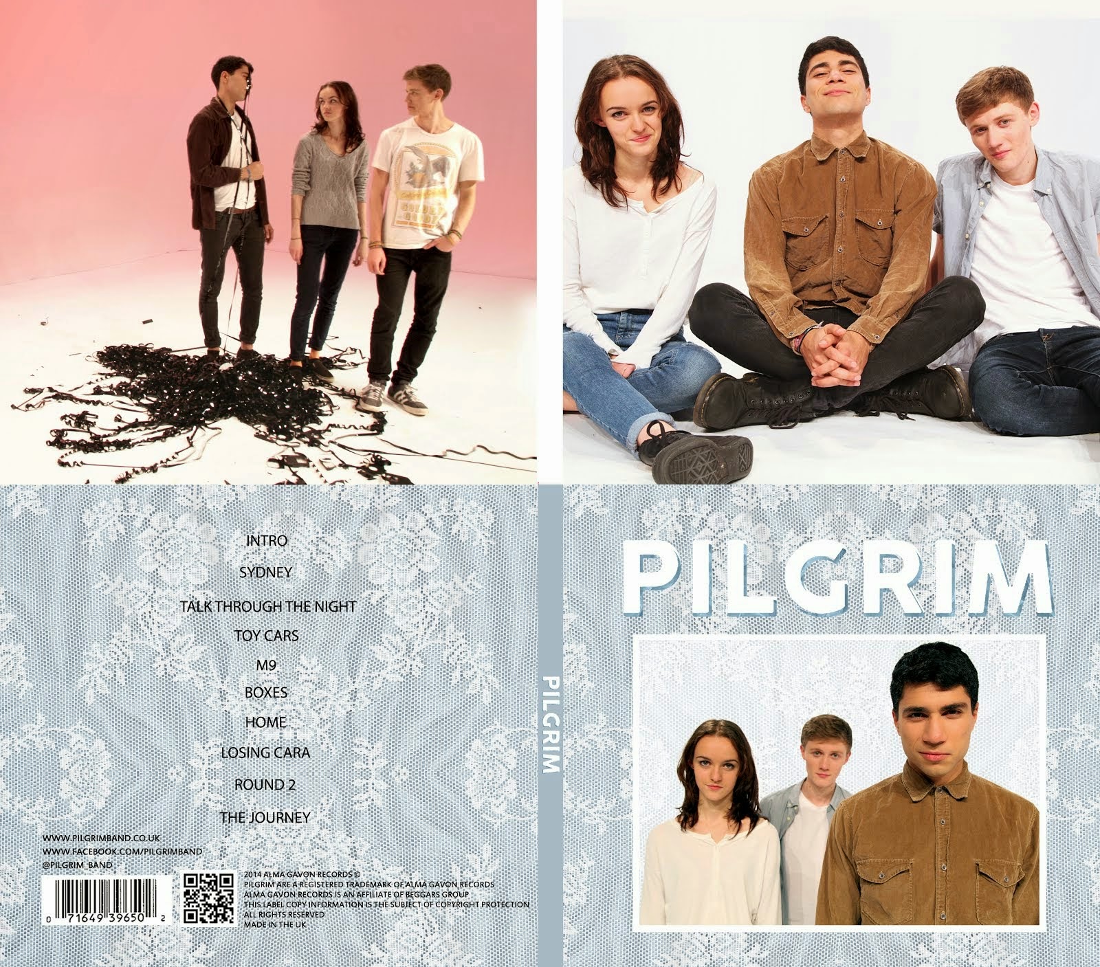
| Thin border, unique font with thin line separating the text, interesting shot of the band with lots of depth and two distinct sections (grey top part with text on top and picture of band on bottom) |
 |
| Frame within a frame, simple colour scheme, large text |
 |
| frame within a frame, nice colour scheme, unique font, picture of the band, very obviously a cover for an indie band |
 |
| frame within a frame, simple black and white colour scheme, large text that is nicely arranged |
 |
| White border, bold white text, interesting picture with striking colours |
 |
| White border, nice use of textures, unique font, muted colours |
 |
| Interesting photo. nice colour scheme that draws attention to the well-arranged text |
 |
| Very aesthetically pleasing with a unique colour scheme, simple layout and nice font |
 |
| Interesting combination of text and texture, possibly something we will emulate |
 |
| Small, simple text with a limited colour scheme and a nice textured overlay |
 |
| Unique look with distinct shapes and nice use of colour |
Back Cover
 |
| The Libertines - Up The Bracket: Messy font and image appeal to rebellious teenagers in particular and reflect the album's style, very unique and a strong sense of genre and band identity |
 |
| Arctic Monkeys - AM: Large band logo with a simple layout, strong sense of band identity |
-back.jpg) |
| The Strokes - Room On Fire: Distinct band image and overall theme with a colour scheme that matches the front cover and reinforces the band identity |
 |
| Vampire Weekend - Contra: Interesting text layout with a unique overall look |
 |
| Darwin Deez - Songs For Imaginative People: Interesting photo of the artist with vibrant colours and simple font |
Conclusion
There are lots of different designs and styles in these images that we can use for inspiration. These are some of the characteristics that we may choose to have in our cover:
- Distinct colour scheme
- Image of the band
- Use of textures (eg. Lewis Watson cover)
- Border
- Lines to separate text
- Bold, sans serif typeface
Most importantly, our album artwork must be unique and eye-catching and must appeal to our target audience while conveying our band's image effectively.


No comments:
Post a Comment