Welcome to my A2 media blog
Welcome to my A2 media blog.
My name is Gavin Fraser (0245). I am part of Group 1 along with Alice Cahill (0130), Kayvon Nabijou (0610) and Mahalia John (0345).
My name is Gavin Fraser (0245). I am part of Group 1 along with Alice Cahill (0130), Kayvon Nabijou (0610) and Mahalia John (0345).
You can navigate my blog using the right hand side column where you will find:
Some information about me
My post labels including 'A2 Production', 'A2 Prelim' and 'A2 Research and Planning'
A live link to The Latymer School Music Video Blog
The blog archive of all my posts
Thank you for taking the time to look at my blog.
Music Video
Digipak
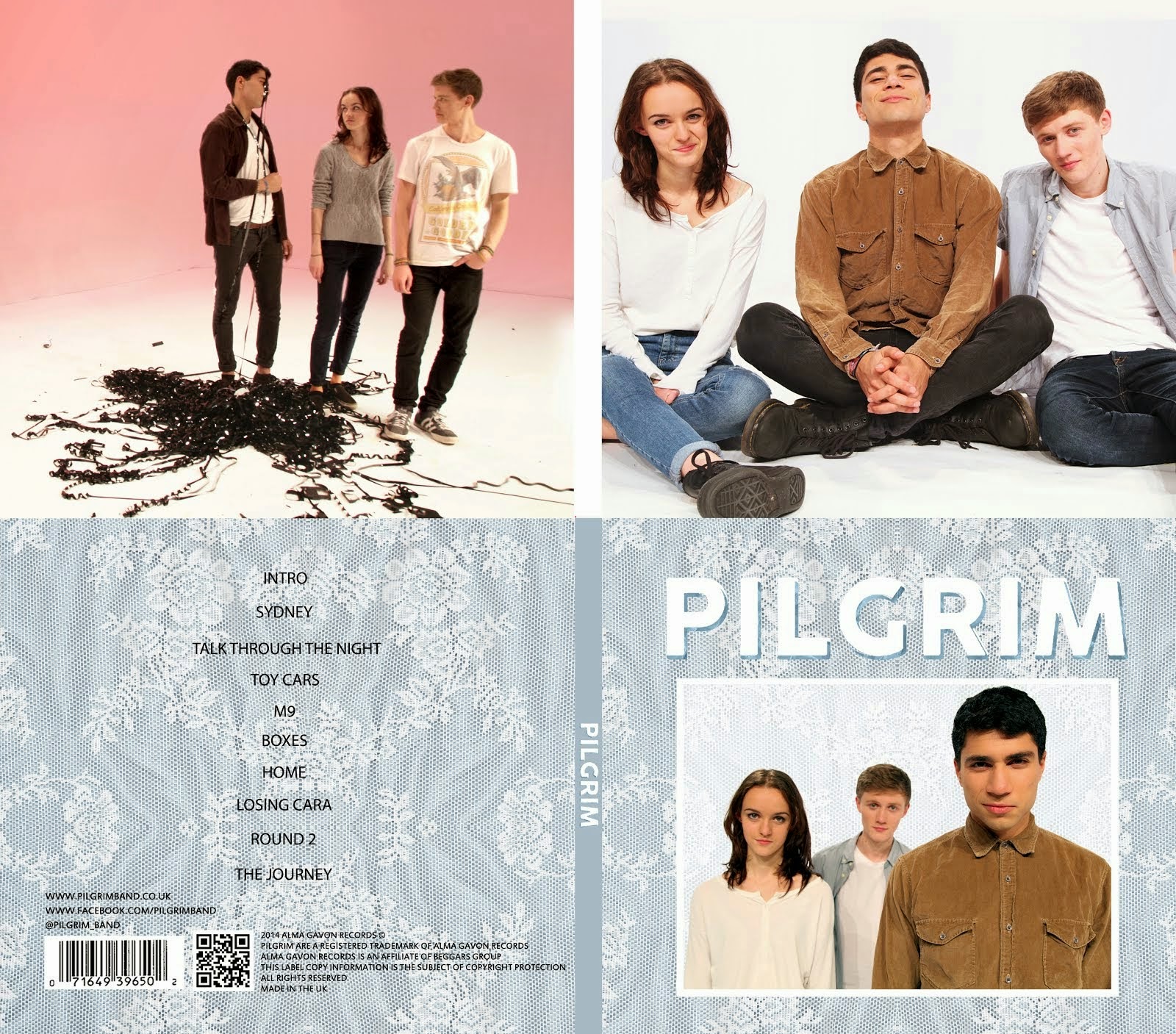
Album Digipak // Top-left to bottom-right: inside back, inside front, back cover, front cover
Wednesday, 28 January 2015
Monday, 29 December 2014
[1] In What Ways Do Your Media Products Use, Develop Or Challenge Forms And Conventions Of Real Media Products?
We took influence from real media products, using and breaking forms and conventions in our three artefacts.
Music Video
When making our music video, we looked at the conventions of music videos and of the indie genre, choosing to break and follow them in various ways. Our video for 'Dog Is Dead's song 'Talk Through The Night' is mainly performance and conceptual with some narrative progression. We were influenced by a number of real music videos. Our Steal-o-matic contains 12 of these. The 5 videos below are the ones that influenced us the most throughout the project.
This video shows how these real music videos influenced ours:
Our Star Identity
We were influenced by real artists and bands when creating identities for out band. We also thought about the personalities of each band member.
Music Video Conventions
When planning our video, we considered the ideas of multiple theorists such as Andrew Goodwin, Carol Vernallis and David Gauntlett. Below are some of the theories that we applied to our video.
Visual Hooks
Goodwin says that music videos often have close-ups of the artist and visually pleasing camera movement to make the video more appealing. Carol Vernallis also says that the camera movement and framing in music videos is usually quite extreme and distinctive. Our video contains lots of these close-ups of the band members and plenty of smooth camera movement. These 'money shots' look good and reinforce the band's image, encouraging the audience to buy into it.
Our floating camera shots were inspired by shots from 'Do The Right Thing' by 'Dog Is Dead' as well as 'Norgaard' by 'The Vaccines'.
Cultural References
According to Goodwin, media texts often reference other texts or cultural iconography. In order to make our artist more relatable, we referenced various things that are associated with our target audience's youth through our use of props and costumes. We wanted to have distinctive iconography that would create nostalgia for the audience. Examples of this post-modern referencing include:
'Dani California' by Red Hot Chili Peppers is a music video that references other texts very obviously and very effectively. This video references various artists from different musical backgrounds, using costumes, set design and choreography to copy distinct looks from different musical areas.
Music, Visuals and Lyrics
All Male Band Members:
Having a female bassist is the most significant way that we made Pilgrim different from other indie bands. We really wanted her to stand out and be aspirational for the female members of our target audience so we made her a major part of our band's identity, giving her a significant role in the music video and presenting her as a confident and cool person in our publicity shots.
We decided that, since our video doesn't have a strong narrative, having an introduction or conclusion wouldn't really be suitable and would probably just detract from the video overall and seem unnecessary.
When creating our website, we were influenced by the websites for 'Rizzle Kicks' and 'The 1975'. We conformed to many of the conventions of indie websites but these two websites particularly inspired us because of their layouts and interactivity.
Website Conventions:
Consistent Header:
Most websites will have a header at the top of the page that remains there wherever you navigate on the website. We chose to follow this convention, creating a header with our band's logo, navigation buttons and social media links.
Conventional Pages:
After looking at other artists' websites, we decided on including the following conventional pages on our website:
These pages are all very common and can be found on almost any artist's website. The Free EP page is slightly less common. We found that artists who are releasing a debut album tend to give away a free EP in order to promote themselves and the album. Artists such as Dog Is Dead, Dan Croll and Ed Sheeran all had a Free EP page on their website. This post goes into more detail about why we included this page.
We decided not to include the very conventional 'news' and 'discography' pages. We didn't include a news page because our home page acts as a hub, bringing together updates about the band from their various social media pages. Therefore, we did not need a news page as the home page serves this purpose. The 1975 also do not have a news page for the same reason.
Since Pilgrim are only releasing their debut album, we did not feel that it was necessary to include a discography page. Similarly to us, Dan Croll's website has no discography page since he has only released one album.
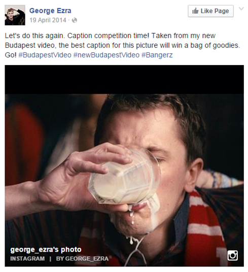
Finally, we also decided to include a 'Win' page. This is not very conventional but we felt it was a good way to get the audience to interact with the band. George Ezra had something similar on his Facebook page, asking people to add a caption to an image to win a goodie bag.
Social Media Links
We found that it is conventional to have social media links at the top of the website. We chose to follow this convention to make our website more interactive.
Non-Linaer Layout
Websites can either be linear or non-linear. We looked at a variety of websites and decided that we liked the non-linear style of websites like The 1975's and Rizzle Kicks' as it was more interactive and visual.
Synergy Between Album Cover And Website
Interactivity
One key element of an artist's website, no matter what the genre, is interactivity. Henry Jenkins' theory on participatory culture states that it is important for audiences and artists to interact. The theory suggests that there are 'low barriers to artistic expression' in our culture and that 'all must believe they are free to contribute'. This is something that we really took on board when designing our website and we tried to make it as interactive as possible.
All of the websites I have referenced allow the audience to interact in some way, be it through the news feed, (The 1975 or Rizzle Kicks), or through various pages such as Dog Is Dead's 'Free EP' page.
We made our website interactive with our non-linear homepage that has intergrated social media links, similar to homepages like The 1975's or Rizzle Kicks', and with our Free EP page.
Other ways that we made our website interactive:
Purchasing Opportunities
Since one of the main purposes of a website is to promote an artist's latest album, it makes sense that it is very conventional to have advertisements for the album present on the website.
Below is an advertisement for our band's album. It is located on our home page among the other posts and has links to the iTunes store and Amazon, making it easy for fans to buy the album.
Music Video
When making our music video, we looked at the conventions of music videos and of the indie genre, choosing to break and follow them in various ways. Our video for 'Dog Is Dead's song 'Talk Through The Night' is mainly performance and conceptual with some narrative progression. We were influenced by a number of real music videos. Our Steal-o-matic contains 12 of these. The 5 videos below are the ones that influenced us the most throughout the project.
 |
| Still Into You - Paramore |
 |
| Ain't It Fun - Paramore |
 |
| Girls - The 1975 |
 |
| Just One Of The Guys - Jenny Lewis |
 |
| Love Is On The Radio - McFly |
This video shows how these real music videos influenced ours:
Our Star Identity
We were influenced by real artists and bands when creating identities for out band. We also thought about the personalities of each band member.
Music Video Conventions
When planning our video, we considered the ideas of multiple theorists such as Andrew Goodwin, Carol Vernallis and David Gauntlett. Below are some of the theories that we applied to our video.
Visual Hooks
Goodwin says that music videos often have close-ups of the artist and visually pleasing camera movement to make the video more appealing. Carol Vernallis also says that the camera movement and framing in music videos is usually quite extreme and distinctive. Our video contains lots of these close-ups of the band members and plenty of smooth camera movement. These 'money shots' look good and reinforce the band's image, encouraging the audience to buy into it.
Our floating camera shots were inspired by shots from 'Do The Right Thing' by 'Dog Is Dead' as well as 'Norgaard' by 'The Vaccines'.
| Do The Right Thing |
| Norgaard |
Cultural References
According to Goodwin, media texts often reference other texts or cultural iconography. In order to make our artist more relatable, we referenced various things that are associated with our target audience's youth through our use of props and costumes. We wanted to have distinctive iconography that would create nostalgia for the audience. Examples of this post-modern referencing include:
- Nintendo 64
- 3D glasses with vintage popcorn box
- Space hopper
- VHS tapes
- Twister
- Jenga
- Superheroes (Superman, Batman and Green Lantern)
This video shows all of the shots where we have postmodern references:
We also included a reference to an iconic song from the rap genre. 'Make It Rain' by Fat Joe and Lil Wayne is widely referenced in popular culture. We parodied this idea by copying with monopoly money. This reflects the themes of our video, putting a very innocent twist on the shot.
 |
| 'Making it rain' in our video |
...
Music, Visuals and Lyrics
Goodwin said that the visuals of a music video can either illustrate, amplify or contradict the music and lyrics. The song that we chose has themes of friendship, youth and nostalgia. We chose to illustrate these themes with the use of props in our video as opposed to contradicting or amplifying them. While we don't directly illustrate the lyrics as the two examples do, we do reflect the themes of the lyrics.
| The 1975 - 'She can't be what you need if she's seventeen' |
| Rizzle Kicks - 'Wanted to be a fireman' |
| 'Now the day is ending and we're getting older' |
Genre Conventions
Each musical genre has conventions that its music videos will stick to according to Goodwin. By following these conventions, fans of the genre will find familiarities in the video and be comfortable with it, enjoying it more. We conformed to the following conventions of indie music videos:
- Performance shots
- Lip-synching
- Beauty or 'money' shots
- Multiple costumes and sets
However, we chose to break the following conventions:
- All male band members
- Complex narrative
- Introduction & Conclusion Using Diegetic Sounds
We did this because we wanted the video to be unique and be interesting for the viewer instead of being exactly the same as other indie videos, whilst not being too unfamiliar.
All Male Band Members:
Having a female bassist is the most significant way that we made Pilgrim different from other indie bands. We really wanted her to stand out and be aspirational for the female members of our target audience so we made her a major part of our band's identity, giving her a significant role in the music video and presenting her as a confident and cool person in our publicity shots.
 |
| Bombay Bicycle Club |
 |
| Vampire Weekend |
 |
| Dog Is Dead |
 |
| Pilgrim |
Complex Narrative:
Instead of focussing on a narrative, we used the video to reinforce the band's image using more conceptual shots that show their personalities. We felt that a complex narrative would have detracted from the video. Below is an example of a video with a complex narrative.
Instead of focussing on a narrative, we used the video to reinforce the band's image using more conceptual shots that show their personalities. We felt that a complex narrative would have detracted from the video. Below is an example of a video with a complex narrative.
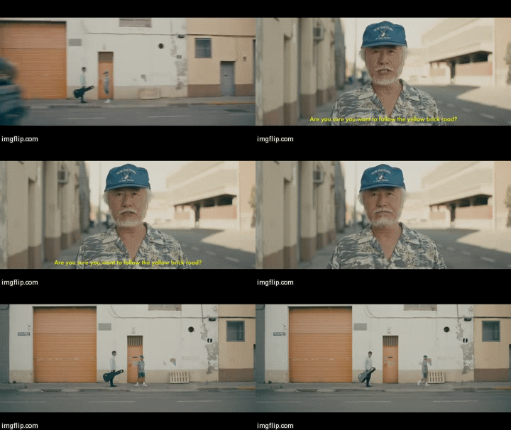 |
| George Ezra - Blame It On Me |
Introduction & Conclusion Using Diegetic Sounds:
Many music videos have short clips either at the beginning and end of the video to introduce and conclude the narrative. Diegetic sound will be used in these clips to immerse the viewer in the world of the characters and get them engaged in the narrative. This use of diegetic sound creates atmosphere and can reinforce a video's narrative well. Below are two narrative videos from indie-rock bands that have small introductions and conclusions, using diegetic sound.
Many music videos have short clips either at the beginning and end of the video to introduce and conclude the narrative. Diegetic sound will be used in these clips to immerse the viewer in the world of the characters and get them engaged in the narrative. This use of diegetic sound creates atmosphere and can reinforce a video's narrative well. Below are two narrative videos from indie-rock bands that have small introductions and conclusions, using diegetic sound.
Below is a video that Mahalia created. It contains clips from three videos that inspired us. In the first music video, there is diegetic sound present throughout, further immersing the viewer in the world of the main character and reinforcing the narrative. This extensive use of diegetic sounds can detract from the song in some cases but it works well here.
We decided that, since our video doesn't have a strong narrative, having an introduction or conclusion wouldn't really be suitable and would probably just detract from the video overall and seem unnecessary.
Performance, Narrative and Conceptual
Goodwin said that all music videos are either performance, narrative, conceptual or a combination of these. On the surface, our video is a combination of performance and conceptual. It consists of shots of the band performing and shots of them playing with props and messing around in the studio. These prop shots give the video its conceptual meaning while the performance shots solidify the band's identity and image.
| Metronomy - The Look - Predominantly performance |
| Arctic Monkeys - Why'd You Only Call Me When You're High - Narrative |
| Fleet Foxes - Mykonos - Conceptual |
However, we do also have some narrative elements in our video. While we don't have a strictly traditional narrative, we do have visual progression that can be interpreted as a narrative. This post explains in detail how we planned to incorporated this into our video, increasing the pace and scale as it went on and building up to the final confetti section.
Carol Vernallis also talks about narrative in her music video theory. She said that narratives don't have be linear and that often a music video's narrative is disjointed or incomplete. This is relevant for our video as our narrative progression is very loose. We end our video with a shot of the band members after they have finished playing. This was heavily inspired by the video for 'Girls' by 'The 1975' where they do something similar.
As our video switches between narrative and conceptual shots, we were able to create multiple identities for the band members within the video. David Gauntlett says that in the modern world identity is more fluid and transformable than ever and that a distinct identity is vital for success. Due to the discontinuous editing style of music videos, we were able to portray both the serious band image in the performance shots and the playful, relatable image in our prop shots, giving our band two separate identities, as shown below.
The music video for Californication by the Red Hot Chili Peppers is a good example of how identities can be fluid in a music video. The video switches between shots of the band performing and of the individual band members as characters in a video game. At the end of the video these identities merge as the video game characters change into their real counterparts.
| Californication - Red Hot Chili Peppers |
Editing
Carol Vernallis said that the editing in music videos is non-linear and that it can either be quite subtle or very noticeable and stylised. In our video, we chose to use mostly very subtle editing to not detract from what is happening in the shots. We cut to the beat a lot but not in a way that is predictable or particularly noticeable. However, we do use some jump cuts throughout the video to add pace. These jump cuts are on the beat and very stylised.
| An example of jump-cutting in 'Budapest' by 'George Ezra' |
We also used a title in the final shot to give the video an ending. Again, this is very stylised and noticeable editing.
Digipak
Website
When creating our website, we were influenced by the websites for 'Rizzle Kicks' and 'The 1975'. We conformed to many of the conventions of indie websites but these two websites particularly inspired us because of their layouts and interactivity.
Website Conventions:
- Same website header across all pages
- Conventional pages - Home, news, discography, gallery, store, etc.
- Social Media links - Facebook, Twitter, Instagram, Tumblr, etc.
- Institutional information in the website's footer
- Synergy with band/artist's most recent album through the use of colour
Consistent Header:
Most websites will have a header at the top of the page that remains there wherever you navigate on the website. We chose to follow this convention, creating a header with our band's logo, navigation buttons and social media links.
Conventional Pages:
| Dan Croll |
| Dog Is Dead |
After looking at other artists' websites, we decided on including the following conventional pages on our website:
- Home
- Biography
- Tour Dates
- Videos
- Photos
- Sign Up
- Store
- Free EP
 |
| Our Website |
These pages are all very common and can be found on almost any artist's website. The Free EP page is slightly less common. We found that artists who are releasing a debut album tend to give away a free EP in order to promote themselves and the album. Artists such as Dog Is Dead, Dan Croll and Ed Sheeran all had a Free EP page on their website. This post goes into more detail about why we included this page.
We decided not to include the very conventional 'news' and 'discography' pages. We didn't include a news page because our home page acts as a hub, bringing together updates about the band from their various social media pages. Therefore, we did not need a news page as the home page serves this purpose. The 1975 also do not have a news page for the same reason.
Since Pilgrim are only releasing their debut album, we did not feel that it was necessary to include a discography page. Similarly to us, Dan Croll's website has no discography page since he has only released one album.
Finally, we also decided to include a 'Win' page. This is not very conventional but we felt it was a good way to get the audience to interact with the band. George Ezra had something similar on his Facebook page, asking people to add a caption to an image to win a goodie bag.
Social Media Links
We found that it is conventional to have social media links at the top of the website. We chose to follow this convention to make our website more interactive.
 |
| George Ezra |
 |
| Rizzle Kicks |
| Our Website |
Non-Linaer Layout
Websites can either be linear or non-linear. We looked at a variety of websites and decided that we liked the non-linear style of websites like The 1975's and Rizzle Kicks' as it was more interactive and visual.
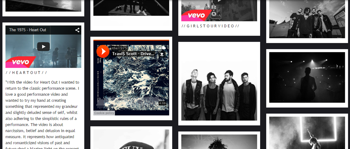 |
| The 1975: non-linear |
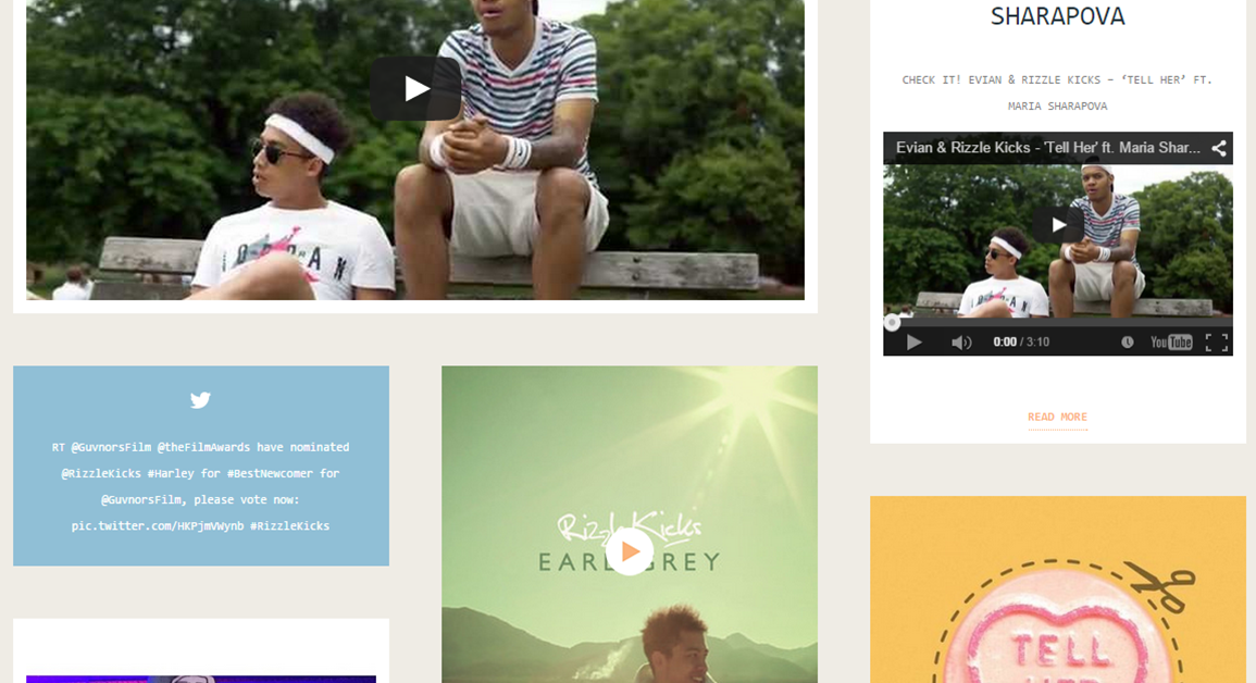 |
| Rizzle Kicks: non-linear |
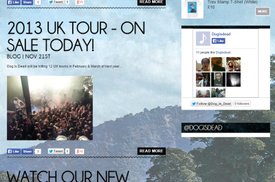 |
| Dog Is Dead: linear |
 |
| Our Website: non-linear |
Synergy Between Album Cover And Website
Interactivity
One key element of an artist's website, no matter what the genre, is interactivity. Henry Jenkins' theory on participatory culture states that it is important for audiences and artists to interact. The theory suggests that there are 'low barriers to artistic expression' in our culture and that 'all must believe they are free to contribute'. This is something that we really took on board when designing our website and we tried to make it as interactive as possible.
All of the websites I have referenced allow the audience to interact in some way, be it through the news feed, (The 1975 or Rizzle Kicks), or through various pages such as Dog Is Dead's 'Free EP' page.
 |
| Fans can sign up for a Free EP on the Dog Is Dead website |
We made our website interactive with our non-linear homepage that has intergrated social media links, similar to homepages like The 1975's or Rizzle Kicks', and with our Free EP page.
 |
| Our 'Free EP' page |
Other ways that we made our website interactive:
...
Purchasing Opportunities
Since one of the main purposes of a website is to promote an artist's latest album, it makes sense that it is very conventional to have advertisements for the album present on the website.
 |
| Dan Croll's website is dominated by this large banner advertising his debut album |
These images are at the top of the homepages for their relevant websites
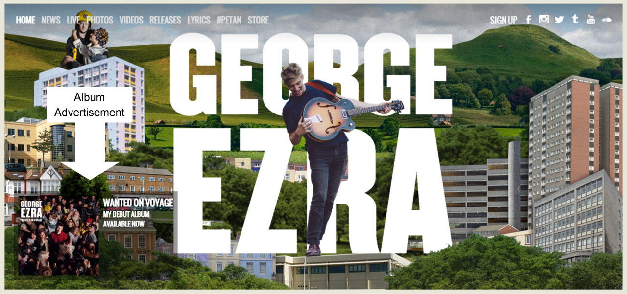 |
| An advertisement for George Ezra's debut album on his homepage |
Below is an advertisement for our band's album. It is located on our home page among the other posts and has links to the iTunes store and Amazon, making it easy for fans to buy the album.
Subscribe to:
Comments (Atom)


.gif)


