Summarise the conventions of title sequences that were most important to this task.
Film openings need to show the people behind the film. There is a minimum number of titles that must be in the title sequence.
On a more artistic level, the titles should add to the sequence and should not be an annoyance. They can be used to draw the viewer's attention to a certain thing on the screen. They can be embedded into the environment. The actors can actually interact with the titles, creating a very interesting effect. However, no matter how it is achieved, the titles should be used to make the sequence better. They should be interesting, following the theme of the show and having a sense of genre.
The sequence itself should introduce characters, themes or ideas, giving the viewer a taster of what the show is like and showing them what they can expect from the show. The sequence could be of a city skyline, a character's morning routine, a small montage of the show's highlights or a series of graphics. Whatever it is, it shouldn't just be a filler. It should be interesting and enjoyable. If the sequence is very clever, it can subtly hint at things. This is done in the Dexter sequence.
2. How did your group plan to edit the title sequence? (consider timings, industry requirements etc).
We knew that we needed to include lots of titles so we decided that we should have roughly one title per shot. We did not have a lot of time so we got straight on with the task, having done basically no planning. We did, however, decide on a theme, a font to use and a colour scheme. We knew fairly well what we were trying to achieve so we went straight ahead and starting working on the sequence.
3. Explain the creative decisions made by your group.
We decided to make the titles white as white goes with almost anything. I also noticed that the sequence had lots of shots that contrasted white and red, such as the tissue or the sink with the blood. The main title was red so, to make it stand out, we went for white on all the credits. The font was quite gothic and formal. This decision was made, partly due to the fact that it looked good, partly due to the fact that it seemed quite formal and followed the sinister and fairly gruesome, bloody theme or the sequence and partly due to the fact that we didn't have much time to choose a font and we thought it was fine so we just went with it.
We started quite ambitiously, making the first title move with the camera. However, we soon realised that if we wanted to complete more than 2 or 3 titles, we would need to make them simpler. We placed the titles in parts of the screen that were near the action but not blocking it, drawing the viewer's eye to the action.
4. How does your re-edit compare to the original?
Out re-edit has potential but the original is definitely better. The original had a jumpy effect on some of the titles, creating quite a tense and on-edge mood. Our titles were simple and, while they looked okay, they weren't great at giving a sense of theme. I do actually prefer the font we used to the font used in the original sequence as I think it creates a more serious mood.
To improve out sequence, I would obviously finish it. However, I also would have liked to have more time to make the titles more involved in the sequence, making them more interesting. For example, when the man looks up at the mirror, I would have liked to have him reveal the text from behind his head, giving the scene depth and appeal. This all would need a lot of time and, with the time that we had, I think we did fairly well with our edit.
Josh also started messing around, it wasn't my fault, I swear.

Digipak
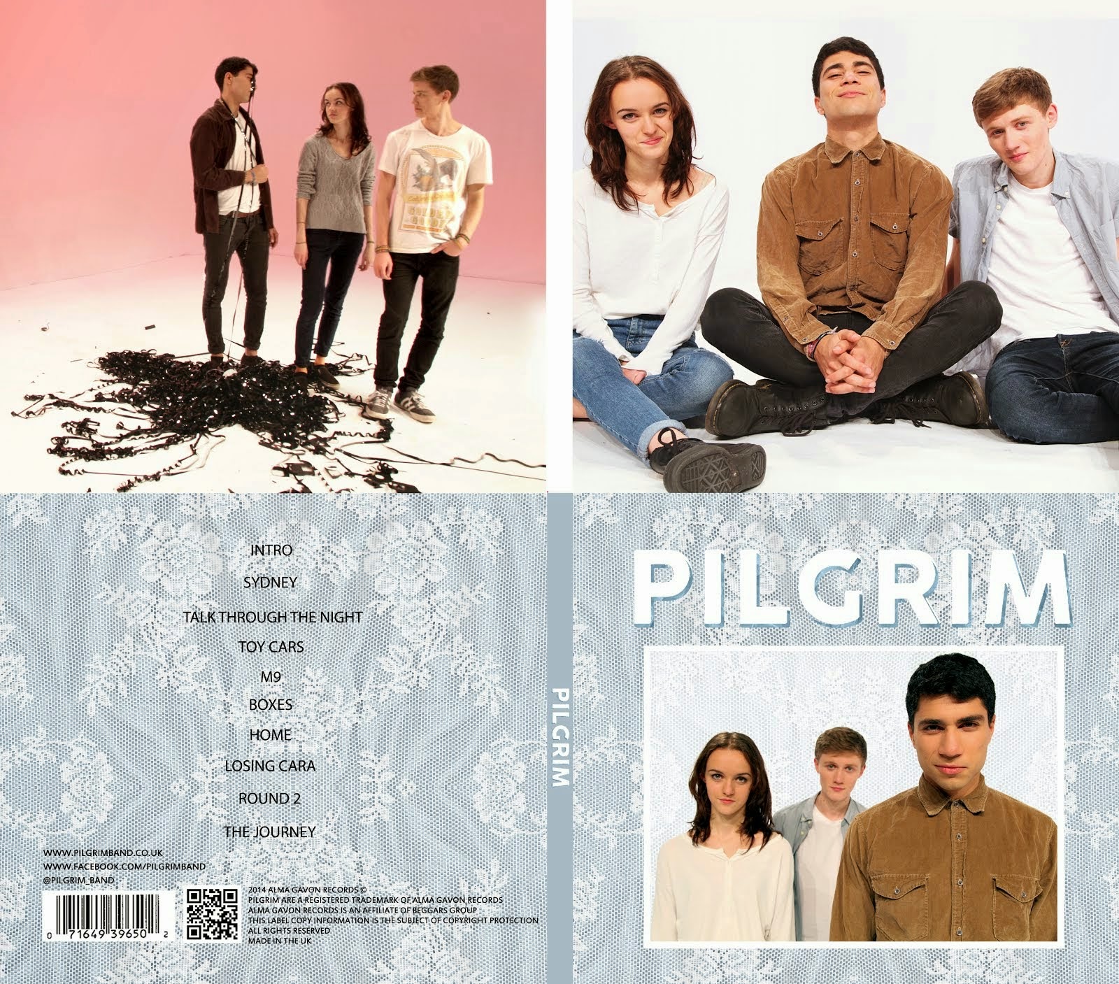
Album Digipak // Top-left to bottom-right: inside back, inside front, back cover, front cover
Website
 Click Image to open Pilgrim's website in a new tab
Subscribe to:
Post Comments (Atom)
Well done, Gavin. Your homework posts have all been presented to a very high standard - particularly your AOTT grid work - and you have shown excellent theoretical understanding in all the tasks. You also use technical terminology with accuracy. Just a couple of points: ensure you check your work for typos and can you add a closing sentence after your opening analysis along the lines of how Trainspotting is a harrowing film about the dangers of addiction etc. You are making excellent progress - please maintain this high standard of work.
ReplyDelete